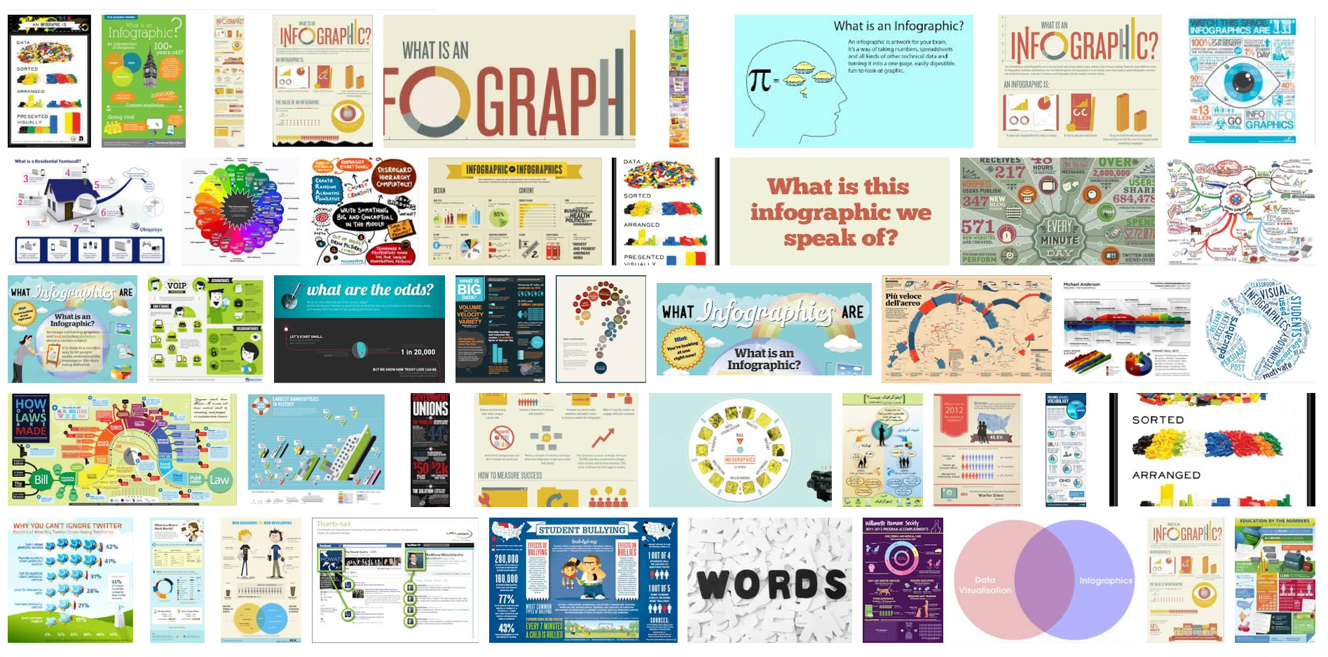
INFOGRAPHICS:
What is an infographic? In all honesty, it is just images compiled with text/data that makes up a single informational graphic on a topic, subject, or concept. Albeit fact, fiction, a tutorial or how-to, infographics provide a greater visual impact than a wall of words or a book.
Color, images, font types and sizes, and the infographic content are what make them appealing to the eye and effective for most viewers. They are simply fast, short, easy, graphical, informative and efficient ways to learn.


MOTIONGRAPHICS:
What are motiongraphics? In a word: Video. The real difference between video and a motion graphic is the content that makes up the video. While video is usually considered movement measured in FPS (frames per second) a motiongraphic is images appearing to have movement and still images brought to life. In essence, a motiongraphic is an infographic morphed into a living presentation.
This motiongraphic uses a combination of info, graphics, audio, and animation: “A Marketers Guide To Pinterest”
Measuring The Universe, Seven Minutes of Terror, Mars in a Minute, Evolution of the F1 Car, Pizza Delivery in NYC, Fast Food, Economy of Coca-Cola, 40 Years of Touring – Bruce Springsteen, Most Popular Halloween Costumes, The Euro is in the Cross-hairs, An Amazing Morphing Campaign Money Map, The Great Titanic, Tornado Tracks from 1950 – 2011, Sherbourne Common – A Storm water Solution
Snippet from Visual.ly – http://visual.ly/learn/data-visualization-tools
“Tableau Public – turn data into visualizations with a simple drag and drop. Customize labels, tool tips, interactive filters and legend displays. There’s no programming language to learn, no Flash, no plug-ins, and no API. Instead, you create interactive data visualizations in minutes and embed on your website or blog.
Plot.io is essentially a web-based version of Tableau. You can analyze millions of rows of data in seconds, and publish your visualizations to the web for free, without downloading or installing software.
Many Eyes – A tool that lets you use your own data for data visualization. Simply upload your own data and get well-designed visualizations. Google Public Data lets you turn public data into a simple visualization. And with the Stat Silk tool you can access world data and customize the way the data is presented visually.”
So which format works best for you? Infographic? MotionGraphic? Both?
Which format works best for your audience? It is merely a matter of personal preference, but when it comes down to cultivating traffic on your site by providing content that informs, educates, and allows you the opportunity to convert visitors to clients, then taking a deeper look into the way we present things both graphically and visually becomes so much more important.
Related Articles for Infographics:
How To Create FREE Infographics
Top Resource for Shared Infographics
How To Create Infographics in PowerPoint
Pingback: 375 Best Infographics | The Internetarian and WEB Concierge
Pingback: Music Video – Will Morris Media